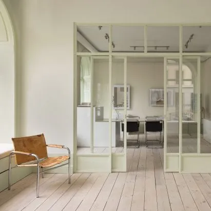
If your office feels like a series of random rooms that gave up on communicating with each other, Swedish design studio ASKA has a surprisingly tasty solution: pistachio green. And no, we are not talking about a single accent wall. We are talking about a full-on chromatic commitment.
The space with an identity crisis
As reported by Dezeen, the project is an office for Fantastic Frank, a real estate agency based in Stockholm. The 160-square-metre space had previously housed a rotating cast of different businesses, which left behind a floor plan that was, to put it politely, architecturally confused. The rooms did not flow. The layout did not make sense. It was basically the interior design equivalent of a group chat where nobody agrees on anything.
ASKA's brief was to build on what was already there rather than gut the whole thing - a smart, sustainable instinct that also happens to be a genuine design challenge. How do you make mismatched spaces feel like they belong together without starting from scratch?
Enter: the pistachio thread
The answer, it turns out, is color theory doing the heavy lifting. ASKA threaded pistachio green accents throughout the entire office, using the hue as a visual connective tissue that ties room to room. It is the design equivalent of wearing the same accessory in every photo - suddenly everything looks intentional.
The result is a workspace that feels cohesive without feeling sterile. The green is soft enough to not overwhelm, distinctive enough to actually work as a unifying device, and chic enough that nobody is going to complain about staring at it for eight hours a day. Pistachio green sits in that sweet spot between bold and livable - which is probably why it has been having such a moment in interiors lately.
Why this actually matters
Beyond the aesthetic flex, this project is a quietly smart argument for working with constraints rather than against them. A lot of commercial redesigns default to the nuclear option - strip everything back, pour concrete, add some exposed pipes, call it a day. ASKA instead treated the fractured layout as a design problem to solve through strategy rather than brute force.
For anyone currently staring down a weird, inherited space - whether it is an office, a flat, or that inexplicable room in your house that used to be three things at once - this Stockholm project is a genuine case study in using color as architecture. Pick one shade. Commit to it. Let it do the work.
Pistachio green, apparently, is not just for gelato anymore.