There's something happening in design right now that feels like a collective exhale. After years of sleek, frictionless digital aesthetics, creatives are reaching for the rough edges again - the smudge, the bleed, the unmistakable mark of a human hand.
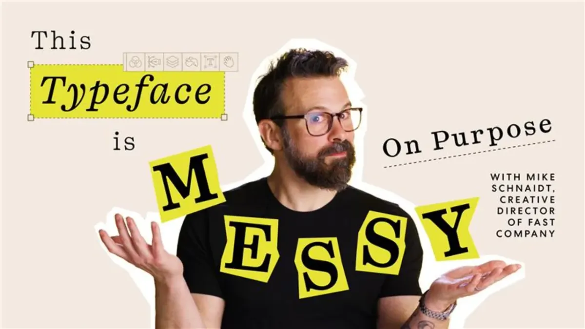
Enter Kyoto, the typeface at the centre of Fast Company's latest issue and the subject of a recent deep-dive by the magazine's creative director Mike Schnaidt. The font is exactly what its name suggests: atmospheric, considered, and rooted in a specific kind of beauty that borrows from Japanese calligraphic tradition while holding its own within classic Latin letterforms.
What makes a typeface 'bleed'?
The 'bleeding' quality Schnaidt references isn't a flaw - it's entirely intentional. It refers to the way ink spreads and softens at the edges of a letterform, mimicking what happens when a brush or pen meets absorbent paper. It's the opposite of the crisp, pixel-perfect fonts that dominate our screens, and that contrast is precisely the point.
In a media landscape where so much editorial design is optimised for digital clarity, choosing a typeface with this kind of organic warmth is a statement. It says: slow down, look closer, this was made by people.
The human touch as a design trend
Schnaidt's choice of Kyoto reflects something broader that's been building across fashion, food packaging, and visual culture generally. Handmade textures, wabi-sabi aesthetics, and anything that telegraphs process over polish are resonating strongly right now. Audiences - particularly younger ones - have developed a sharp eye for authenticity, and they're drawn to work that shows its seams.
Kyoto pulls off something genuinely tricky: it bridges two rich typographic traditions without feeling like a novelty. The calligraphic influence gives it soul, while the Latin structure keeps it functional and legible. It's a typeface you can actually use, not just admire.
Why this matters beyond the page
Typography might sound like an insider concern, but typeface choices shape how we feel about the content we consume, often without us realising it. A font communicates mood, era, intent, and trust before a single word registers consciously. When a publication as influential as Fast Company leans into something this handcrafted and considered, it nudges the wider conversation about what good design feels like right now.
The answer, increasingly, is: warm, imperfect, and alive.