
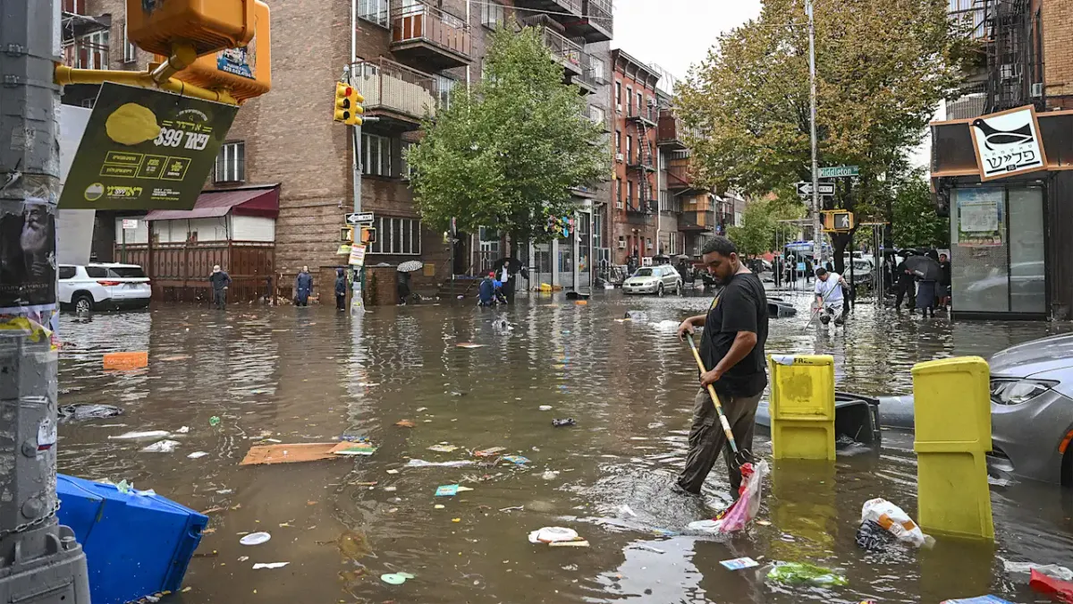
If you live in New York City, there's a roughly one-in-five chance your block sits in a flood-vulnerable area. That's the striking takeaway from a new interactive map created by researchers at the New York Botanical Garden, which charts what they're calling "Blue Zones" across the five boroughs.
What exactly is a Blue Zone?
Not to be confused with the longevity-focused Blue Zones you might have heard about in wellness circles, these are something altogether more urgent. According to Fast Company, the researchers define Blue Zones as places where water is present, used to be historically, or is projected to be in the future as climate change accelerates. Think former wetlands, areas prone to storm surges, and low-lying inland blocks that don't get nearly as much attention as the waterfront.
That last part is key. While it's easy to picture flooding risk as a coastline problem - and Sandy certainly hammered that point home - the map highlights how inland neighborhoods face real exposure too. More than a fifth of New York City falls within these zones, which is a sobering number for a city of 8 million people.
Why this matters beyond the obvious
Climate conversations can sometimes feel abstract, especially when they're framed around projections decades out. What makes this tool genuinely useful is that it brings the risk down to the block level. That kind of granularity helps residents, renters, and homeowners make more informed decisions - whether that's understanding their insurance needs, thinking twice about a basement apartment, or simply knowing what to expect during a major storm.
It's also a resource for city planners and advocates pushing for smarter infrastructure investment. New York has already seen what happens when the wrong neighborhoods get caught off guard by flooding, and having a clearer picture of vulnerability across all five boroughs could help direct resources before the next major weather event hits.
The bigger picture
New York City is almost entirely surrounded by water, which has always been central to its identity and economy. But that geography is becoming an increasingly complicated asset as sea levels rise and storms intensify. Tools like this interactive map are part of a growing push to make climate risk visible and actionable at the neighborhood level - not just as a policy talking point, but as practical, usable information for everyday New Yorkers.
If you're in or around the city, it's worth spending a few minutes exploring the map. Knowing where you stand - literally - has never been more relevant.