
Somewhere in the multiverse, the New York Knicks are playing basketball under a logo featuring the Empire State Building, and honestly? We were robbed.
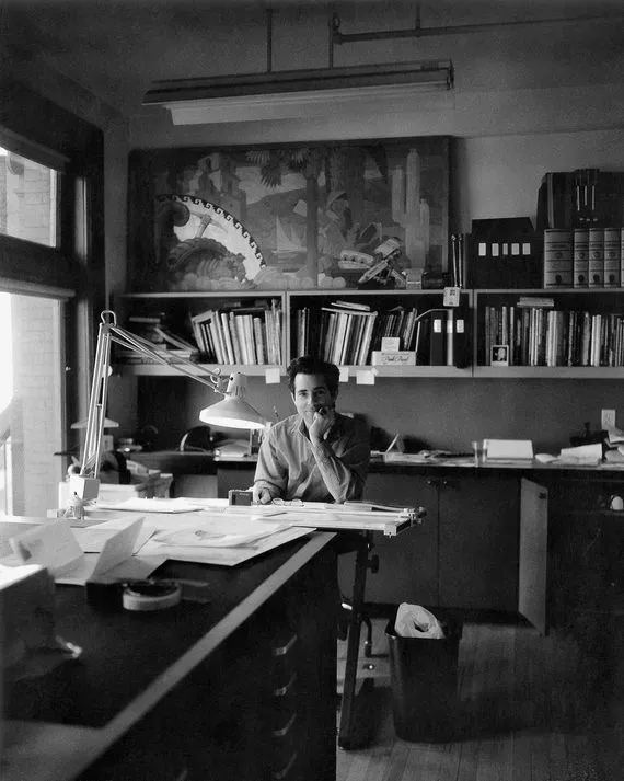
Graphic designer Michael Doret, the guy responsible for drawing the Knicks' iconic 1991 logo, recently shared a collection of his rejected concepts - and they are fascinating. According to Curbed, one of those early drafts included New York's most famous skyscraper, which would have been either the most inspired piece of sports branding ever conceived or a complete disaster. Possibly both simultaneously.
The lost art of logo rejection
Here's the thing about logo design that most people never think about: for every iconic mark you recognize, there are dozens of dead-end concepts rotting in a drawer somewhere. The ones that got killed. The ones the committee said no to. The ones that, thirty years later, the designer still thinks about.
Doret is clearly one of those designers who keeps receipts, and we are absolutely here for it. Sharing your rejects takes a certain kind of confidence - you have to be secure enough in the final product (which, to be fair, the Knicks logo absolutely holds up) to admit that the road there was a little chaotic.
Why this actually matters
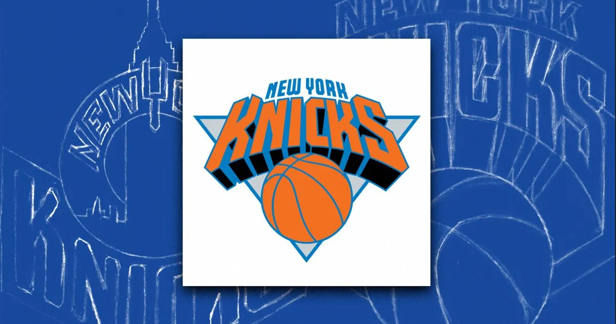
Sports logos are weirdly important cultural artifacts. They end up on billions of dollars of merchandise, they get tattooed on human bodies, and they become shorthand for entire cities and communities. The Knicks logo in particular is one of the cleaner, more timeless designs in the NBA - that retro lettering has aged like fine wine while other teams have been through four redesigns and a mild identity crisis.
The fact that it nearly featured a landmark skyscraper is a reminder of how arbitrary these decisions can feel in the moment, and how permanent they turn out to be. One vote the other way and we're all wearing Empire State Building hats to Madison Square Garden.

The real takeaway
Michael Doret deserves more flowers than he gets. Designing a logo that survives over three decades in professional sports, through fashion cycles, design trend waves, and the general chaos of the internet, is genuinely hard. Most things from 1991 look dated. His Knicks mark does not.
Also, someone please find those full reject files. We need to see everything. Every version. Every what-if. Sports design history is criminally underdocumented, and this is exactly the kind of story that should be told in full.