
Most rebrands are the corporate equivalent of a haircut you immediately regret. A new font here, a slightly rounder logo there, and suddenly the press release is calling it a "bold new chapter." But the Allen Institute - the nonprofit bioscience research institute founded by Microsoft co-founder Paul Allen to literally map the human brain - just did something genuinely interesting with its visual identity.
Who did this, and why should you care?
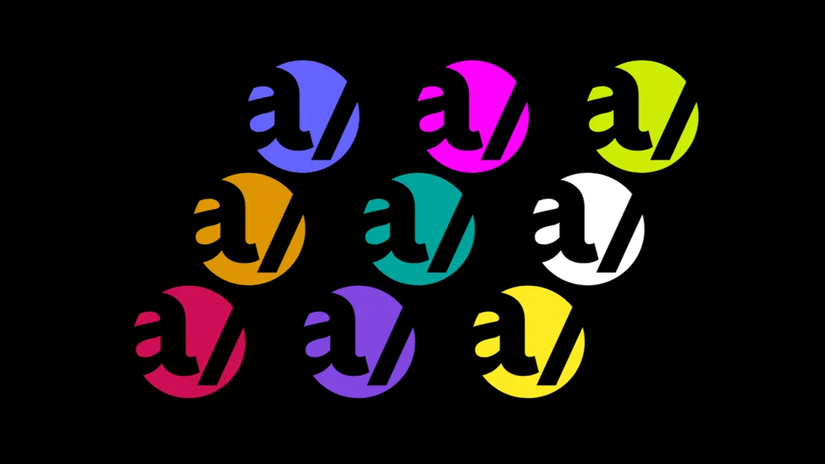
The designer behind it is Neville Brody, which is a bit like hiring Spielberg to film your birthday party. Brody has designed for Coca-Cola, Nike, and Channel 4. He's a proper legend in the industry. So when he says the previous Allen Institute logo was "at the heart of everything," you know he's not just being polite before torching the whole thing.
And torch it he did - thoughtfully. According to Fast Company, Brody and his team approached this rebrand by thinking horizontally rather than vertically. Instead of designing a logo and then figuring out how to apply it everywhere, they flipped the whole philosophy: the brand itself becomes a platform for everything the institute does.
What does 'brand as platform' actually mean, though?
Great question, and fair to be skeptical - "brand as platform" sounds like exactly the kind of thing someone says in a meeting to justify a very expensive decision. But in this context it makes genuine sense. The Allen Institute isn't selling sneakers. It's doing complex, multidisciplinary science that spans neuroscience, cell biology, and immunology. A rigid, top-down logo system would suffocate that kind of work under a layer of corporate sameness.
By building the identity as a flexible system rather than a fixed mark, the new brand can actually breathe alongside the research. Different programs and projects can express themselves visually while still belonging to the same family. It's less "one logo to rule them all" and more "a visual language everyone can speak."
Why this matters beyond the design world
Science communication is genuinely hard. Institutions doing serious, complex research often look either intimidatingly sterile or embarrassingly try-hard when they attempt to seem approachable. A well-considered identity that actually reflects the spirit of the work - curious, rigorous, a little bit playful - is rarer than it should be.
The Allen Institute mapping the human brain deserves a brand that feels as ambitious and alive as that mission sounds. Based on the coverage in Fast Company, it looks like it might finally have one.